GUI for Processing
Use the following classes to create useful graphical user interfaces for your Processing sketches

Button class
Create simple rectangle or round buttons that latch or are momentary.

Slider class
Create simple sliders with customizable features.
Dial Class Documentation
Setup:
Use the following outline to create a new Dial object. For examples purposes, myDial is a generic name for a new Dial object. This generic name should be replaced with a more descriptive name for the Dial and the variable it will control.
step 1:
Copy and paste the Dial class into your sketch
step 2:
Declare new Dial object as a global object:
Dial myDial;step 3:
Identify the appropriate constructor for your needs and initialize the Dial object within the setup method of your sketch:
float myVariable = 0;

void setup() {
  myDial = new Dial("Dial", 400, 300, myVariable)
}
NOTE:
The Dial class has two constructors. Both constructors require a name, the x position, the y position, and the value. The second constructor does require two extra parameters that allow for customizing the range, minimum and maximum values, for the dial. The default value range is from 0 (minimum) to 100 (maximum). The constructors with the parameter order and variable types are below:
(String name, float x, float y, float value)
(String name, float x, float y, float value, int min, int max)
Note:
The x and y parameters use the default ellipseMode(CENTER) indicating the center of the ellipse corresponds to the x and y values.
step 4:
Add the update method within the mouseDragged method for UI control:
void mouseDragged() {
  myDial.update();
}
step 5:
Assign the variable to controlled by the dial position within the draw method to update on each cycle:
void draw() {
  myVariable = myDial.getDialValue();
}
step 6:
Display the dial within the draw method.
void draw() {
  background(255);
  myVariable = myDial.getDialValue();
  myDial.display();
}
step 7:
Customize dial if necessary using attributes from the attribute list.
float myVariable = 0;

void setup() {
  myDial = new Dial("Dial", 400, 300, myVariable)
  // Add customization attributes here
  myDial.dialColor = color(23, 44, 20);
}
Attribute List
Use dot syntax to access individual attributes. Reminder: myDial is a generic name for a Dial object used for example purposes and it should be replaced by a more descriptive name in a sketch.
| Name: | dialActiveColor |
| Example: | myDial.dialActiveColor = color(45, 45, 200); |
| Description: | Set the color of the dail body and value markers when dial is active (mouse over). |
| Syntax: | myDial.dialActiveColor = color(c1); |
| Parameters: | c1 color: color value |
| Related: |
dialColor |
| Name: | dialColor |
| Example: | myDial.dialColor = color(123, 45, 32); |
| Description: | Set the color of the dail body. |
| Syntax: | myDial.dialColor = color(c1) |
| Parameters: | c1 color: color value |
| Related: |
highlightColor |
| Name: | nameClearance |
| Example: | myDial.nameClearance = 20; |
| Description: | Set the distance between the name display and the edge of the dial body. |
| Syntax: | myDial.nameclearnace = v1; |
| Parameters: | v1 int: distance |
| Related: |
setDialName |
| Name: | nameTextColor |
| Example: | myDial.nameTextColor = color(0); |
| Description: | Set the color of the dial name text. |
| Syntax: | myDial.nameTextColor = color(c1); |
| Parameters: | c1 color: color value |
| Related: |
setDialName |
| Name: | nameTextSize | ||||||||||||||||||||||||||||||||||||||||||||||||||||||||||||||||||||||||||||||||||||||||||||||||||||||||||||||||||||||||||||||||||||||||||||||||||||||||||||||||||||||||||||||||||||||||||||||||||||||||||||||||||||||||||||||||||||||||||||||||||||||||||||||||||||||||||||||||||||||||||||||||||||||||||||||||||||||||||||||||||||||||||||||||||||||||||||||||||||||||||||||||||||||||||||||||||||||||||||||||||||||||||||||||||||||||||||||||||||||||||||||||||||||||||||||||||||||||||||||
| Example: | myDial.nameTextSize = 14; | ||||||||||||||||||||||||||||||||||||||||||||||||||||||||||||||||||||||||||||||||||||||||||||||||||||||||||||||||||||||||||||||||||||||||||||||||||||||||||||||||||||||||||||||||||||||||||||||||||||||||||||||||||||||||||||||||||||||||||||||||||||||||||||||||||||||||||||||||||||||||||||||||||||||||||||||||||||||||||||||||||||||||||||||||||||||||||||||||||||||||||||||||||||||||||||||||||||||||||||||||||||||||||||||||||||||||||||||||||||||||||||||||||||||||||||||||||||||||||||||
| Description: | Set the text size of the dial name text. | ||||||||||||||||||||||||||||||||||||||||||||||||||||||||||||||||||||||||||||||||||||||||||||||||||||||||||||||||||||||||||||||||||||||||||||||||||||||||||||||||||||||||||||||||||||||||||||||||||||||||||||||||||||||||||||||||||||||||||||||||||||||||||||||||||||||||||||||||||||||||||||||||||||||||||||||||||||||||||||||||||||||||||||||||||||||||||||||||||||||||||||||||||||||||||||||||||||||||||||||||||||||||||||||||||||||||||||||||||||||||||||||||||||||||||||||||||||||||||||||
| Syntax: | myDial.textSize = v1; | ||||||||||||||||||||||||||||||||||||||||||||||||||||||||||||||||||||||||||||||||||||||||||||||||||||||||||||||||||||||||||||||||||||||||||||||||||||||||||||||||||||||||||||||||||||||||||||||||||||||||||||||||||||||||||||||||||||||||||||||||||||||||||||||||||||||||||||||||||||||||||||||||||||||||||||||||||||||||||||||||||||||||||||||||||||||||||||||||||||||||||||||||||||||||||||||||||||||||||||||||||||||||||||||||||||||||||||||||||||||||||||||||||||||||||||||||||||||||||||||
| Parameters: | v1 int: text size | ||||||||||||||||||||||||||||||||||||||||||||||||||||||||||||||||||||||||||||||||||||||||||||||||||||||||||||||||||||||||||||||||||||||||||||||||||||||||||||||||||||||||||||||||||||||||||||||||||||||||||||||||||||||||||||||||||||||||||||||||||||||||||||||||||||||||||||||||||||||||||||||||||||||||||||||||||||||||||||||||||||||||||||||||||||||||||||||||||||||||||||||||||||||||||||||||||||||||||||||||||||||||||||||||||||||||||||||||||||||||||||||||||||||||||||||||||||||||||||||
| Related: |
setDialName |
||||||||||||||||||||||||||||||||||||||||||||||||||||||||||||||||||||||||||||||||||||||||||||||||||||||||||||||||||||||||||||||||||||||||||||||||||||||||||||||||||||||||||||||||||||||||||||||||||||||||||||||||||||||||||||||||||||||||||||||||||||||||||||||||||||||||||||||||||||||||||||||||||||||||||||||||||||||||||||||||||||||||||||||||||||||||||||||||||||||||||||||||||||||||||||||||||||||||||||||||||||||||||||||||||||||||||||||||||||||||||||||||||||||||||||||||||||||||||||||
| Name: | roundValTo |
| Example: | myDial.roundValTo = 1; |
| Description: | Set the decimal round of value display. Default is -1. |
| Syntax: | myDial.roundValTo = v1; |
| Parameters: | v1 int: decimal round value/td> |
| Related: |
setShowValue |
| Name: | setDialName |
| Example: | myDial.setDialName("Dial"); |
| Description: | Set the name of the dial. |
| Syntax: | myDial.setDialName("Str"); |
| Parameters: | Str String: dial name |
| Related: |
dialNameColor |
| Name: | setDialSize |
| Example: | myDial.setDialSize(100); |
| Description: | Set the diameter size of the dial. Default is 80. |
| Syntax: | myDial.setDialSize(v1); |
| Parameters: | v1 int: dial size |
| Related: |
dialColor |
| Name: | setDialValue |
| Example: | myDial.setDialValue(55); |
| Description: | Update the value of the dial. |
| Syntax: | myDial.setDialValue(v1); |
| Parameters: | v1 float: value of variable |
| Related: |
setShowValue |
| Name: | setMarkerSize |
| Example: | myDial.setMarkerSize(14); |
| Description: | Set the size of the value markers that surround the dial. |
| Syntax: | myDial.setMarkerSize(v1); |
| Parameters: | v1 int: size value |
| Related: |
setNumValueMarkers |
| Name: | setNumValueMarkers | ||||||||||||||||||||||||||||||||||||||||||||||||||||||||||||||||||||||||||||||||||||||||||||||||||||||||||||||||||||||||||||||||||||||||||||||||||||||||||||||||||||||||||||||||||||||||||||||||||||||||||||||||||||||||||||||||||||||||||||||||||||||||||||||||||||||||||||||||||||||||||||||||||||||||||||||||||||||||||||||||||||||||||||||||||||||||||||||||||||||||||||||||||||||||||||||||||||||||||||||||||||||||||||||||||||||||||||||||||||||||||||||||||||||||||||||||||||||||||||||
| Example: | myDial.setNumValueMarkers(20); | ||||||||||||||||||||||||||||||||||||||||||||||||||||||||||||||||||||||||||||||||||||||||||||||||||||||||||||||||||||||||||||||||||||||||||||||||||||||||||||||||||||||||||||||||||||||||||||||||||||||||||||||||||||||||||||||||||||||||||||||||||||||||||||||||||||||||||||||||||||||||||||||||||||||||||||||||||||||||||||||||||||||||||||||||||||||||||||||||||||||||||||||||||||||||||||||||||||||||||||||||||||||||||||||||||||||||||||||||||||||||||||||||||||||||||||||||||||||||||||||
| Description: | Set the number of value markers that surround the dial. | ||||||||||||||||||||||||||||||||||||||||||||||||||||||||||||||||||||||||||||||||||||||||||||||||||||||||||||||||||||||||||||||||||||||||||||||||||||||||||||||||||||||||||||||||||||||||||||||||||||||||||||||||||||||||||||||||||||||||||||||||||||||||||||||||||||||||||||||||||||||||||||||||||||||||||||||||||||||||||||||||||||||||||||||||||||||||||||||||||||||||||||||||||||||||||||||||||||||||||||||||||||||||||||||||||||||||||||||||||||||||||||||||||||||||||||||||||||||||||||||
| Syntax: | myDial.setNumValueMarkers(v1); | ||||||||||||||||||||||||||||||||||||||||||||||||||||||||||||||||||||||||||||||||||||||||||||||||||||||||||||||||||||||||||||||||||||||||||||||||||||||||||||||||||||||||||||||||||||||||||||||||||||||||||||||||||||||||||||||||||||||||||||||||||||||||||||||||||||||||||||||||||||||||||||||||||||||||||||||||||||||||||||||||||||||||||||||||||||||||||||||||||||||||||||||||||||||||||||||||||||||||||||||||||||||||||||||||||||||||||||||||||||||||||||||||||||||||||||||||||||||||||||||
| Parameters: | v1 int: number of value markers | ||||||||||||||||||||||||||||||||||||||||||||||||||||||||||||||||||||||||||||||||||||||||||||||||||||||||||||||||||||||||||||||||||||||||||||||||||||||||||||||||||||||||||||||||||||||||||||||||||||||||||||||||||||||||||||||||||||||||||||||||||||||||||||||||||||||||||||||||||||||||||||||||||||||||||||||||||||||||||||||||||||||||||||||||||||||||||||||||||||||||||||||||||||||||||||||||||||||||||||||||||||||||||||||||||||||||||||||||||||||||||||||||||||||||||||||||||||||||||||||
| Related: |
setMarkerSize |
||||||||||||||||||||||||||||||||||||||||||||||||||||||||||||||||||||||||||||||||||||||||||||||||||||||||||||||||||||||||||||||||||||||||||||||||||||||||||||||||||||||||||||||||||||||||||||||||||||||||||||||||||||||||||||||||||||||||||||||||||||||||||||||||||||||||||||||||||||||||||||||||||||||||||||||||||||||||||||||||||||||||||||||||||||||||||||||||||||||||||||||||||||||||||||||||||||||||||||||||||||||||||||||||||||||||||||||||||||||||||||||||||||||||||||||||||||||||||||||
| Name: | setTheme |
| Example: | myDial.setTheme("LIGHT"); |
| Description: | Set the color theme of the dial between default, "DARK" and "LIGHT" themes. |
| Syntax: | myDial.setTheme(Str); |
| Parameters: | Str String: "LIGHT" or "DARK" |
| Related: |
dialColor |
| Name: | setXPos |
| Example: | myDial.setXPos(200); |
| Description: | Set the x value of the dial. |
| Syntax: | myDial.setXPos(v1); |
| Parameters: | v1 float: x position |
| Related: |
setYPos |
| Name: | setYPos |
| Example: | myDial.setYPos(300); |
| Description: | Set the y value of the dial. |
| Syntax: | myDial.setYPos(v1); |
| Parameters: | v1 float: y position |
| Related: |
setXPos |
| Name: | valueMarkerColor |
| Example: | myDial.valueMarkerColor = color(120, 45, 20); |
| Description: | Set the color of the value markers that surround the dial. |
| Syntax: | myDial.valueMarkerColor = color(c1); |
| Parameters: | c1 color: color value |
| Related: |
dialColor |
| Name: | valueMarkerFillColor | ||||||||||||||||||||||||||||||||||||||||||||||||||||||||||||||||||||||||||||||||||||||||||||||||||||||||||||||||||||||||||||||||||||||||||||||||||||||||||||||||||||||||||||||||||||||||||||||||||||||||||||||||||||||||||||||||||||||||||||||||||||||||||||||||||||||||||||||||||||||||||||||||||||||||||||||||||||||||||||||||||||||||||||||||||||||||||||||||||||||||||||||||||||||||||||||||||||||||||||||||||||||||||||||||||||||||||||||||||||||||||||||||||||||||||||||||||||||||||||||
| Example: | myDial.valueMarkerFillColor = color(50, 55, 25); | ||||||||||||||||||||||||||||||||||||||||||||||||||||||||||||||||||||||||||||||||||||||||||||||||||||||||||||||||||||||||||||||||||||||||||||||||||||||||||||||||||||||||||||||||||||||||||||||||||||||||||||||||||||||||||||||||||||||||||||||||||||||||||||||||||||||||||||||||||||||||||||||||||||||||||||||||||||||||||||||||||||||||||||||||||||||||||||||||||||||||||||||||||||||||||||||||||||||||||||||||||||||||||||||||||||||||||||||||||||||||||||||||||||||||||||||||||||||||||||||
| Description: | Set the color of the value markers when the value is greater than or equal to value marker. | ||||||||||||||||||||||||||||||||||||||||||||||||||||||||||||||||||||||||||||||||||||||||||||||||||||||||||||||||||||||||||||||||||||||||||||||||||||||||||||||||||||||||||||||||||||||||||||||||||||||||||||||||||||||||||||||||||||||||||||||||||||||||||||||||||||||||||||||||||||||||||||||||||||||||||||||||||||||||||||||||||||||||||||||||||||||||||||||||||||||||||||||||||||||||||||||||||||||||||||||||||||||||||||||||||||||||||||||||||||||||||||||||||||||||||||||||||||||||||||||
| Syntax: | myDial.valueMarkerFillColor = color(c1); | ||||||||||||||||||||||||||||||||||||||||||||||||||||||||||||||||||||||||||||||||||||||||||||||||||||||||||||||||||||||||||||||||||||||||||||||||||||||||||||||||||||||||||||||||||||||||||||||||||||||||||||||||||||||||||||||||||||||||||||||||||||||||||||||||||||||||||||||||||||||||||||||||||||||||||||||||||||||||||||||||||||||||||||||||||||||||||||||||||||||||||||||||||||||||||||||||||||||||||||||||||||||||||||||||||||||||||||||||||||||||||||||||||||||||||||||||||||||||||||||
| Parameters: | c1 color: color value | ||||||||||||||||||||||||||||||||||||||||||||||||||||||||||||||||||||||||||||||||||||||||||||||||||||||||||||||||||||||||||||||||||||||||||||||||||||||||||||||||||||||||||||||||||||||||||||||||||||||||||||||||||||||||||||||||||||||||||||||||||||||||||||||||||||||||||||||||||||||||||||||||||||||||||||||||||||||||||||||||||||||||||||||||||||||||||||||||||||||||||||||||||||||||||||||||||||||||||||||||||||||||||||||||||||||||||||||||||||||||||||||||||||||||||||||||||||||||||||||
| Related: |
dialColor |
||||||||||||||||||||||||||||||||||||||||||||||||||||||||||||||||||||||||||||||||||||||||||||||||||||||||||||||||||||||||||||||||||||||||||||||||||||||||||||||||||||||||||||||||||||||||||||||||||||||||||||||||||||||||||||||||||||||||||||||||||||||||||||||||||||||||||||||||||||||||||||||||||||||||||||||||||||||||||||||||||||||||||||||||||||||||||||||||||||||||||||||||||||||||||||||||||||||||||||||||||||||||||||||||||||||||||||||||||||||||||||||||||||||||||||||||||||||||||||||
| Name: | valueTextColor | ||||||||||||||||||||||||||||||||||||||||||||||||||||||||||||||||||||||||||||||||||||||||||||||||||||||||||||||||||||||||||||||||||||||||||||||||||||||||||||||||||||||||||||||||||||||||||||||||||||||||||||||||||||||||||||||||||||||||||||||||||||||||||||||||||||||||||||||||||||||||||||||||||||||||||||||||||||||||||||||||||||||||||||||||||||||||||||||||||||||||||||||||||||||||||||||||||||||||||||||||||||||||||||||||||||||||||||||||||||||||||||||||||||||||||||||||||
| Example: | myDial.valueTextColor = color(255); | ||||||||||||||||||||||||||||||||||||||||||||||||||||||||||||||||||||||||||||||||||||||||||||||||||||||||||||||||||||||||||||||||||||||||||||||||||||||||||||||||||||||||||||||||||||||||||||||||||||||||||||||||||||||||||||||||||||||||||||||||||||||||||||||||||||||||||||||||||||||||||||||||||||||||||||||||||||||||||||||||||||||||||||||||||||||||||||||||||||||||||||||||||||||||||||||||||||||||||||||||||||||||||||||||||||||||||||||||||||||||||||||||||||||||||||||||||
| Description: | Set the text color of the value text. | ||||||||||||||||||||||||||||||||||||||||||||||||||||||||||||||||||||||||||||||||||||||||||||||||||||||||||||||||||||||||||||||||||||||||||||||||||||||||||||||||||||||||||||||||||||||||||||||||||||||||||||||||||||||||||||||||||||||||||||||||||||||||||||||||||||||||||||||||||||||||||||||||||||||||||||||||||||||||||||||||||||||||||||||||||||||||||||||||||||||||||||||||||||||||||||||||||||||||||||||||||||||||||||||||||||||||||||||||||||||||||||||||||||||||||||||||||
| Syntax: | myDial.valueTextColor = color(c1); | ||||||||||||||||||||||||||||||||||||||||||||||||||||||||||||||||||||||||||||||||||||||||||||||||||||||||||||||||||||||||||||||||||||||||||||||||||||||||||||||||||||||||||||||||||||||||||||||||||||||||||||||||||||||||||||||||||||||||||||||||||||||||||||||||||||||||||||||||||||||||||||||||||||||||||||||||||||||||||||||||||||||||||||||||||||||||||||||||||||||||||||||||||||||||||||||||||||||||||||||||||||||||||||||||||||||||||||||||||||||||||||||||||||||||||||||||||
| Parameters: | c1 color: color value | ||||||||||||||||||||||||||||||||||||||||||||||||||||||||||||||||||||||||||||||||||||||||||||||||||||||||||||||||||||||||||||||||||||||||||||||||||||||||||||||||||||||||||||||||||||||||||||||||||||||||||||||||||||||||||||||||||||||||||||||||||||||||||||||||||||||||||||||||||||||||||||||||||||||||||||||||||||||||||||||||||||||||||||||||||||||||||||||||||||||||||||||||||||||||||||||||||||||||||||||||||||||||||||||||||||||||||||||||||||||||||||||||||||||||||||||||||
| Related: |
valueTextSize |
||||||||||||||||||||||||||||||||||||||||||||||||||||||||||||||||||||||||||||||||||||||||||||||||||||||||||||||||||||||||||||||||||||||||||||||||||||||||||||||||||||||||||||||||||||||||||||||||||||||||||||||||||||||||||||||||||||||||||||||||||||||||||||||||||||||||||||||||||||||||||||||||||||||||||||||||||||||||||||||||||||||||||||||||||||||||||||||||||||||||||||||||||||||||||||||||||||||||||||||||||||||||||||||||||||||||||||||||||||||||||||||||||||||||||||||||||
| Name: | valueTextSize |
| Example: | myDial.valueTextSize = 50; |
| Description: | Set the text size for the value text. |
| Syntax: | myDial.valueTextSize = v1; |
| Parameters: | v1 int: text size |
| Related: |
valueTextColor |
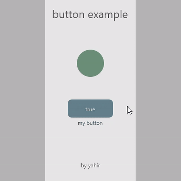
Button Class Documentation
Setup:
Use the following outline to create a new Button object. For examples purposes, myButton is a generic name for a new Button object. This generic name should be replaced with a more descriptive name for the Button and the variable it will control.
step 1:
Copy and paste the Button class into your sketch
step 2:
Declare new Button object as a global object:
Button myButton;step 3:
Initialize the Button object within the setup method of your sketch:
boolean myVariable = false;

void setup() {
  myButton = new Button ("Name", 400, 300, myVariable)
}
NOTE:
The x and y positions use the rectMode(CENTER) and thus correspond to the center position of the button. When using a ROUND button the default ellipseMode(CENTER) is used.
NOTE:
The Button class constructor requires a name, the x position, the y position, and the variable controlled. The constructor parameter order and variable types are below:
(String name, float x, float y, float value) step 4:
Latch button: Add the update method within the mouseClicked method for UI control:
void mouseDragged() {
  myButton.update();
}
Momentary button: Add the updateMomentary method within the draw method for UI control:
void draw() {
  myButton.updateMomentary();
}
step 5:
Assign the variable to controlled by the button within the draw method to update on each cycle:
void draw() {
  myVariable = myButton.getValue();
  myButton.updateMomentary(); // If using momentary button
}
step 6:
Display the button within the draw method.
void draw() {
  background(255);
  myVariable = myButton.getValue();
  myButton.updateMomentary(); // If using momentary button
  myButton.display();
}
step 7:
Customize button if necessary using attributes from the attribute list.
boolean myVariable = false;

void setup() {
  myButton= new Button("Name", 400, 300, myVariable)
  // Add customization attributes here
  myButton.setButtonType("ROUND");
}
Attribute List
Use dot syntax to access individual attributes. Reminder: myButton is a generic name for a Button object used for example purposes and it should be replaced by a more descriptive name in a sketch.
| Name: | buttonActiveColor |
| Example: | myButton.buttonActiveColor = color(232, 45, 65); |
| Description: | Set the color of the button when active (mouse hover). |
| Syntax: | myButton.buttonActiveColor = color(c1); |
| Parameters: | c1 color: color value |
| Related: |
buttonFalseColor |
| Name: | buttonFalseColor |
| Example: | myButton.buttonFalseColor = color(50, 125, 145); |
| Description: | Set the color of the button when the button value is false. |
| Syntax: | myButton.buttonFalseColor = color(c1); |
| Parameters: | c1 color: color value |
| Related: |
buttonActiveColor |
| Name: | buttonTrueColor |
| Example: | myButton.buttonTrueColor = color(100, 200, 225); |
| Description: | Set the color of the button when the button value is true. |
| Syntax: | myButton.buttonTrueColor = color(c1); |
| Parameters: | c1 color: color value |
| Related: |
buttonActiveColor |
| Name: | nameTextClearance |
| Example: | myButton.nameTextClearance = 20; |
| Description: | Set the distance between the name display and the edge of the button body. |
| Syntax: | myButton.nameTextClearance = v1; |
| Parameters: | v1 int: distance value |
| Related: |
valueTextColor |
| Name: | nameTextColor |
| Example: | myButton.nameTextColor = color(100); |
| Description: | Set the color of the button name text. |
| Syntax: | myButton.nameTextColor = color(c1); |
| Parameters: | c1 color: color value |
| Related: |
valueTextColor |
| Name: | setButtonHeight |
| Example: | myButton.setButtonHeight(60); |
| Description: | Set the height of the button. When button type is set to round the height controls the button diam. Default value is 40 pexels. |
| Syntax: | myButton.setButtonHeight(v1); |
| Parameters: | v1 int: height value |
| Related: |
buttonTrueColor |
| Name: | setButtonName |
| Example: | myButton.setButtonName("Menu"); |
| Description: | Set the name of the button. Initially set in the constructor |
| Syntax: | myButton.setButtonName(s1); |
| Parameters: | s1 String: name String |
| Related: |
nameTextColor |
| Name: | setButtonType |
| Example: | myButton.setButtonType("ROUND"); |
| Description: | Set the button type to round or rectangular. Default settings is rectangular. |
| Syntax: | myButton.setButtonType(s1); |
| Parameters: | s1 String: "RECT" or "ROUND" |
| Related: |
setButtonHeight |
| Name: | setButtonWidth |
| Example: | myButton.setButtonWidth(120); |
| Description: | Set the width of the button. Default value is 100 pexels. |
| Syntax: | myButton.setButtonWidth(v1); |
| Parameters: | v1 int: width value |
| Related: |
buttonTrueColor |
| Name: | setNameTextSize |
| Example: | myButton.setNameTextSize(20); |
| Description: | Set the text size of the button name. |
| Syntax: | myButton.setNameTextSize(v1); |
| Parameters: | v1 int: text size value |
| Related: |
setValueTextSize |
| Name: | setTheme |
| Example: | myButton.setTheme("LIGHT"); |
| Description: | Set the color theme of the button between default, "DARK", and the alternative "LIGHT" theme. Dark buttons appear best against light backgrounds and light buttons appear best against dark backgrounds. |
| Syntax: | myButton.setTheme(s1); |
| Parameters: | s1 String: String value |
| Related: |
buttonActiveColor |
| Name: | setValueFalseText |
| Example: | myButton.setValueFalseText("off"); |
| Description: | Set the display text when the button value is false. |
| Syntax: | myButton.setValueFalseText(s1); |
| Parameters: | s1 String: string value |
| Related: |
setValueTrueText |
| Name: | setValueTextSize |
| Example: | myButton.setValueTextSize(16); |
| Description: | Set the text size of the value display. |
| Syntax: | myButton.setValueTextSize(v1); |
| Parameters: | v1 int: text size value |
| Related: |
setNameTextSize |
| Name: | setValueTrueText |
| Example: | myButton.setValueTrueText("on"); |
| Description: | Set the display text when the button value is true. |
| Syntax: | myButton.setValueTrueText(s1); |
| Parameters: | s1 String: String value |
| Related: |
setValueFalseText |
| Name: | valueTextColor |
| Example: | myButton.valueTextColor = color(33, 40, 140); |
| Description: | Set the color of the value display text. |
| Syntax: | myButton.valueTextColor = color(c1); |
| Parameters: | c1 color: color value |
| Related: |
nameTextColor |
Slider Class Documentation
Setup:
Use the following outline to create a new Slider object. For examples purposes, mySlider is a generic name for a new Slider object. This generic name should be replaced with a more descriptive name for the Slider and the variable it will control.
STEP 1:
Copy and paste the Slider class into your sketch
STEP 2:
Declare new Slider object as a global object:
Slider mySlider;STEP 3:
Identify the appropriate constructor for your needs and initialize the Slider object within the setup method of your sketch:
float myVariable = 10;

void setup() {
  mySlider = new Slider("Name", 400, 300, myVariable)
}
NOTE:
The Slider class has two constructors. Both constructors require a name, the x position, the y position, and the variable controlled. The second constructor does require two extra parameters that allow for customizing the range, minimum and maximum values, for the Slider. The default value range is from 0 (minimum) to 100 (maximum). The constructors with the parameter order and variable types are below:
(String name, float x, float y, float value)
(String name, float x, float y, float value, int min, int max)
NOTE:
The x and y parameters use the default rectMode(LEFT) indicating the slider is positioned based on the upper left corner of the slider.
step 4:
Add the update method within the mouseClicked method for UI control:
void mouseDragged() {
  mySlider.update();
}
step 5:
Assign the variable to controlled by the button within the draw method to update on each cycle:
void draw() {
  myVariable = mySlider.getValue();
}
step 6:
Display the slider within the draw method.
void draw() {
  background(255);
  myVariable = mySlider.getValue();
  mySlider.display();
}
step 7:
Customize the slider if necessary using attributes from the attribute list.
float myVariable = 10;

void setup() {
  mySlider = new Slider("Name", 400, 300, myVariable)
  // Add customization attributes here
  mySlider.setOrientation("VERTICAL");
}
Attribute List
Use dot syntax to access individual attributes. Reminder: mySlider is a generic name for a slider object used for example purposes and it should be replaced by a more descriptive name in a sketch.
| Name: | nameColor |
| Example: | mySlider.nameColor = color(100, 50, 100); |
| Description: | Set the text color of the slider name. |
| Syntax: | mySlider.nameColor = color(c1); |
| Parameters: | c1 color: color value |
| Related: |
valueColor |
| Name: | sliderActiveColor |
| Example: | mySlider.sliderActiveColor = color(50, 125, 145); |
| Description: | Set the color of the slider when the slider is active (mouse over). |
| Syntax: | mySlider.sliderActiveColor = color(c1); |
| Parameters: | c1 color: color value |
| Related: |
sliderColor |
| Name: | sliderColor |
| Example: | mySlider.sliderColor = color(200, 25, 23); |
| Description: | Set the background color of the slider. |
| Syntax: | mySlider.sliderColor = color(c1); |
| Parameters: | c1 color: color value |
| Related: |
sliderActiveColor |
| Name: | setShowFill |
| Example: | mySlider.setShowFill(false); |
| Description: | Display a fill color equal to the value of the slider when set to true. Default is set to true. |
| Syntax: | mySlider.setShowFill(boolean); |
| Parameters: | boolean value: true or false |
| Related: |
sliderFillColor |
| Name: | sliderFillColor |
| Example: | mySlider.sliderFillColor = color(122, 68, 98); |
| Description: | Set the fill color of the slider. |
| Syntax: | mySlider.sliderFillColor = color(c1); |
| Parameters: | c1 color: color value |
| Related: |
sliderActiveColor |
| Name: | setNameLocation |
| Example: | mySlider.setNameLocation("LEFT"); |
| Description: | Set the display location of the slider name. Default location is BOTTOM. |
| Syntax: | mySlider.setNameLocation(s1); |
| Parameters: | s1 String: horizontal values: "BOTTOM", "LEFT" "TOP" vertical values: "BOTTOM", "BOTTOM_TILT", "LEFT", "LEFT_VERT", "TOP", "TOP_TILT" |
| Related: |
nameColor |
| Name: | setNameSize |
| Example: | mySlider.setNameSize(16); |
| Description: | Set the text size of slider name. Default size is 14 font. |
| Syntax: | mySlider.setNameSize(v1); |
| Parameters: | v1 int: text size |
| Related: |
nameColor |
| Name: | setOrientation |
| Example: | mySlider.setOrientation("VERTICAL"); |
| Description: | Set the display orientation of the slider. Default orientation is horizontal. |
| Syntax: | mySlider.setOrientation(s1); |
| Parameters: | s1 String: "HORIZONTAL" or "VERTICAL" |
| Related: |
setNameLocation |
| Name: | setShowTab |
| Example: | mySlider.setShowTab(false); |
| Description: | Display a slider tab for equal to slider value for visual clarity. Default is set to false. |
| Syntax: | mySlider.setShowTab(boolean); |
| Parameters: | boolean value: true or false |
| Related: |
sliderFillColor |
| Name: | setSliderHeight |
| Example: | mySlider.setSliderHeight(35); |
| Description: | Set the height of the slider as it relates when displayed horizontally. Default value is 20 pixels. |
| Syntax: | mySlider.setSliderHeight(v1); |
| Parameters: | v1 int: height |
| Related: |
setSliderWidth |
| Name: | setSliderWidth |
| Example: | mySlider.setSliderWidth(140); |
| Description: | Set the width of the slider as it relates when displayed horizontally. Default value is 200 pixels. |
| Syntax: | mySlider.setSliderWidth(v1); |
| Parameters: | v1 int: width |
| Related: |
setSliderHeight |
| Name: | setTabSize |
| Example: | mySlider.setTabSize(30); |
| Description: | Set the size of the tab within the slider. Default size is 30 pixels. Note: setShowTab must be set to true. |
| Syntax: | mySlider.setTabSize(v1); |
| Parameters: | v1 int: size |
| Related: |
setShowTab |
| Name: | setTheme |
| Example: | mySlider.setTheme("LIGHT"); |
| Description: | Set the color theme of the slider between default, "DARK", and the alternative "LIGHT" theme. Dark sliders appear best against light backgrounds and light sliders appear best against dark backgrounds. |
| Syntax: | mySlider.setTheme(s1); |
| Parameters: | s1 String: "LIGHT" or "DARK" |
| Related: |
setNameLocation |
| Name: | setValueSize |
| Example: | mySlider.setValueSize(140); |
| Description: | Set the text size of the value display. Default size is 12 font. |
| Syntax: | mySlider.setValueSize(v1); |
| Parameters: | v1 int: text size |
| Related: |
valueColor |
| Name: | tabColor |
| Example: | mySlider.tabColor = color(20, 50, 43); |
| Description: | Set the text color of the slider tab when displayed. |
| Syntax: | mySlider.tabColor = color(c1); |
| Parameters: | c1 color: color value |
| Related: |
tabActiveColor |
| Name: | tabActiveColor |
| Example: | mySlider.tabActiveColor = color(220, 200, 198); |
| Description: | Set the text color of the slider tab when active (mouse over). |
| Syntax: | mySlider.tabActiveColor = color(c1); |
| Parameters: | c1 color: color value |
| Related: |
tabColor |
| Name: | nameClearance |
| Example: | mySlider.nameClearance = 16; |
| Description: | Set the distance between the name display and the edge of the slider body. Default valu eis 15 pixels. |
| Syntax: | mySlider.nameClearance = v1; |
| Parameters: | v1 int: clearance value |
| Related: |
setNameSize |
| Name: | nameRotation |
| Example: | mySlider.nameRotation = -30; |
| Description: | Set the rotation amount in degrees when using name locations ending with TILT. |
| Syntax: | mySlider.nameRotation = v1; |
| Parameters: | v1 int: rotation value |
| Related: |
setNameLocation |
| Name: | roundValTo |
| Example: | mySlider.roundValTo = 2; |
| Description: | Set the rounding amount of the value display text. Default is -1 rounding to a whole number. |
| Syntax: | mySlider.roundValTo = v1; |
| Parameters: | v1 int: round value |
| Related: |
setValueSize |
| Name: | valueColor |
| Example: | mySlider.valueColor = color(34, 145, 150); |
| Description: | Set the text color of the value display. |
| Syntax: | mySlider.valueColor = color(c1); |
| Parameters: | c1 color: color value |
| Related: |
nameColor |